To learn more about heatmaps, visit our Wikinbiot Post, where we explain in detail what a heatmap is, how they work in My inBiot Platform and why they're useful.
How to interpret My inBiot's Heatmaps
Understanding the Structure
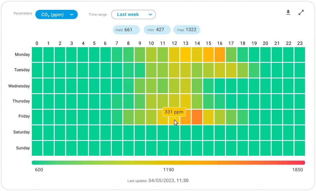
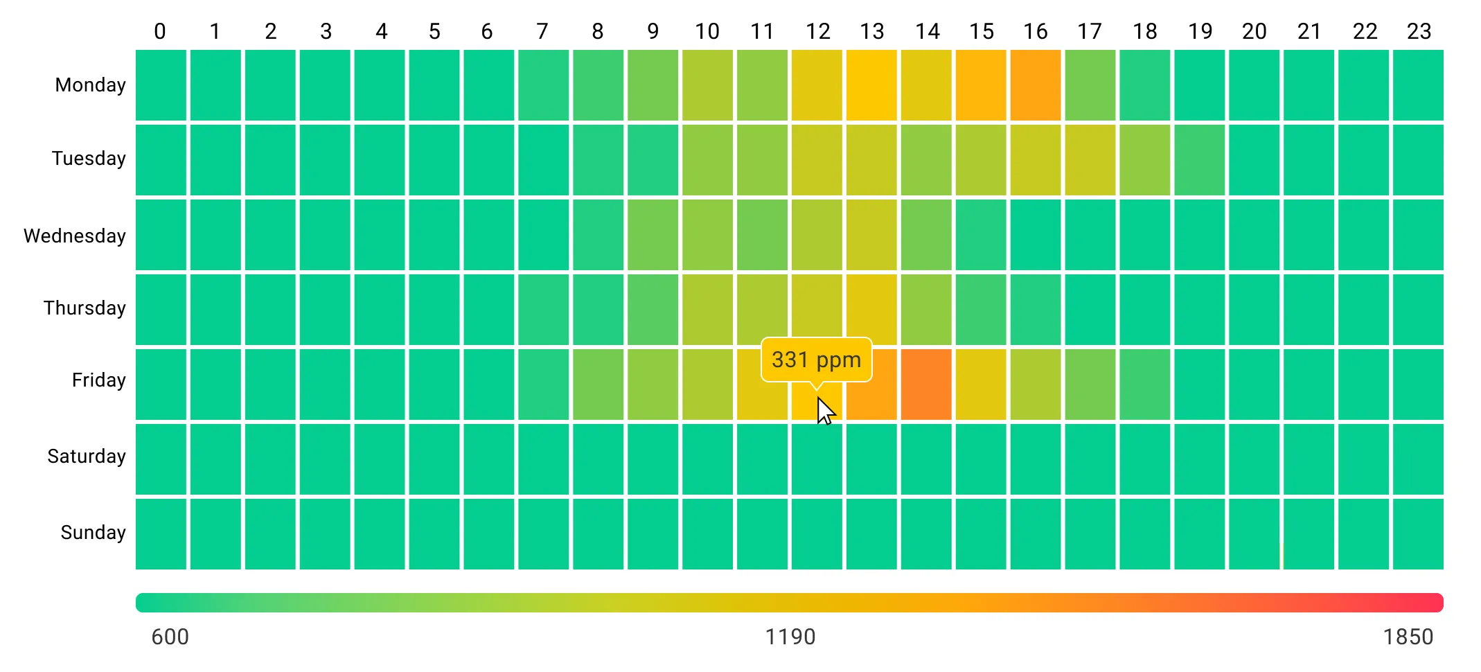
The median (med.), minimum (min.) and maximum (max.) values can be found at the top of the heatmap.
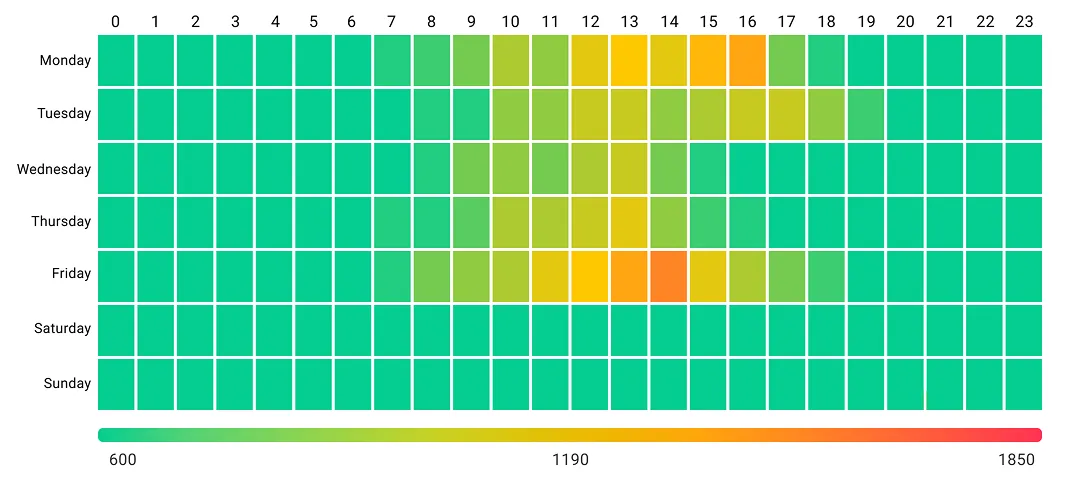
The heatmap is a grid of coloured squares, where each square represents data for a specific time (columns) and day (rows).
The X-axis (horizontal) shows the hours of the day (0–23).
The Y-axis (vertical) represents the days of the week (Monday–Sunday).
Note: Hovering over a specific cell shows the exact value.
What the Colours Mean
Differentcolours correspond to different levels of a measured parameter.
Green = Lower values.
Yellow to Orange = Medium values.
Red = High values.
The color scale at the bottom indicates the intensity of the parameter being measured (CO₂ in ppm for this example).
The numbers displayed under the color scale (600, 1190, 1850), reference the value in which the green, yellow and red colours are "pure".
Note: These numbers do not indicate the recommended levels, they are a visual reference only.
Example: In this case, values under 600ppm will remain the same green colour and values higher than 1850ppm will remain the same red colour.
What the Values Mean
The value of each cell is determined by aggregating all measurements recorded within the corresponding hourly interval. Additionally, if the selected study period exceeds one week, the representative value of each cell will be calculated as the arithmetic mean of all values recorded in the same time slot across different weeks.
Example : The selected cell in the image (331 ppm) represents the aggregation of all measurements collected between 12:00 and 12:59 on all Fridays within the study period.